Home>Community & Lifestyle>Finding Quality PNG Images for Your Running Blog and Race Content
Community & Lifestyle
Finding Quality PNG Images for Your Running Blog and Race Content
Published: September 18, 2026
Running bloggers and coaches: find fresh PNG images with transparent backgrounds for thumbnails, infographics, and race posts that stand out from generic stock photos.
(Many of the links in this article redirect to a specific reviewed product. Your purchase of these products through affiliate links helps to generate commission for Therunningadvisor.com, at no extra cost. Learn more)
If you publish running content every week, you already know the struggle. Stock photo sites recycle the same handful of images, your readers start recognizing them, and your posts start blending together in a sea of sameness. The fix is not a bigger budget for premium photography. It is a smarter system for finding visual assets that actually fit the specific post you are writing, not the generic idea of “a runner.”
Content Creator’s Checklist:
– Transparent-background PNGs give you far more design flexibility than JPEGs for thumbnails and infographics
– Browsing a structured topic index cuts search time and keeps your visual style consistent across posts
– A daily discovery feed surfaces unexpected visuals that spark editorial ideas before you even plan a post
– Using themed image categories helps you match visuals to specific race types, seasons, and fitness topics
– A reliable image pipeline reduces the friction that causes bloggers to skip visuals entirely
Why Running Bloggers Need a Different Approach to Images
Most advice about blog visuals assumes you are writing about food or travel. Running content has different demands. You are covering gear reviews, training plans, race recaps, nutrition posts, and coaching tips, often all in the same month. Each of those needs a visual identity that feels like it belongs in your ecosystem, not grabbed at random from a site that serves every vertical equally.
The format matters, too. Portable Network Graphics, the PNG format, exists specifically because it handles transparency and fine detail better than JPEG. When you are placing a running silhouette on top of a colored thumbnail background, or layering a shoe graphic into an infographic, a PNG with a transparent background is the only format that works cleanly. A JPEG leaves a white box around your graphic that breaks the whole layout.
Running coaches who build out weekly newsletters, training program landing pages, and social media posts have an even bigger appetite for this kind of asset. They need volume, variety, and quality, without burning hours every week hunting for images.
What Makes a Visual Pipeline Actually Work
A visual pipeline sounds fancier than it is. It just means you have a predictable, repeatable source of images that you return to, rather than doing a fresh search from scratch every time you sit down to write a post.
The bloggers who publish consistently are rarely the ones with the most creative energy in the moment. They are the ones who built a system. That system includes a content calendar, a drafting routine, and yes, a reliable source of visuals that matches their niche. Without that last piece, posts get delayed or go live with no image at all, which kills click-through rates across every platform.
Here is what a strong visual pipeline looks like for a running blogger:
- A go-to source organized by topic so you can find category-appropriate images fast
- A secondary discovery source that surfaces fresh visuals you would not have thought to search for
- A personal folder or bookmarking habit so images you find early get used later
That second point, the discovery layer, is where most bloggers fall short. They search for what they already know they need. But some of the best thumbnails come from a visual you stumbled on that reframed the angle of the entire post.
Using a Topic Index to Stay Organized and On-Brand
Topic-based browsing is the structured side of your image workflow. Instead of typing a keyword into a search bar and hoping for the best, you browse by category. Sports. Fitness. Outdoors. People. Nature. This approach keeps your posts visually coherent, because you are always pulling from the same thematic territory.
For a running blog specifically, you will spend most of your time in sports and fitness categories, but outdoor themes are useful for race recap posts and trail content. When you browse image topics by theme, you also start to notice which visual styles are underrepresented in your niche. That gap is an opportunity. A post about early-morning training that uses a sunrise and silhouette graphic rather than a bright gym photo stands out immediately.
The practical advantage here is speed. You already know which category applies to the post you are writing. You go there, scan what is available, pick the one that fits, and you are done. No rabbit holes, no fifteen-tab spiral.
How to Integrate Discovery Into Your Editorial Calendar
The structured index handles your planned content. But some of the best content ideas come from the image itself. That is where a daily discovery feed earns its place in your routine.
Browsing the daily PNG feature takes about two minutes. You are not looking for anything specific. You are just scanning for something that sparks a post idea. A detailed trail map graphic might prompt a “how to read race elevation charts” post you had not planned. A bold weather icon might trigger a cold-weather running guide. A striking shoe silhouette might become the lead visual for a gear comparison article.
This is editorial discovery. Photographers and magazine editors have used version of this process for decades, letting the visual library inform the story pitch rather than just illustrating it after the fact. Running bloggers can use it the same way.
The key is making it habitual. Check it when you are in planning mode, not when you are under deadline. You want to build a backlog of image ideas that are ready to match with future posts, not scramble for something at 11pm before publishing.
Matching Image Style to Race Content Specifically
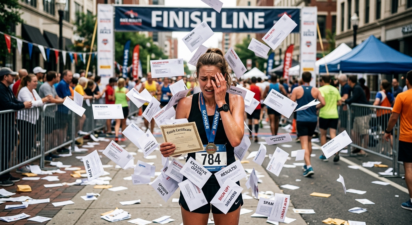
Race content is one of the trickiest categories to illustrate well. The obvious choice is a finish-line photo or a GPS watch screenshot, but those get old fast. Here is a numbered breakdown of how to approach visual selection for race-specific posts:
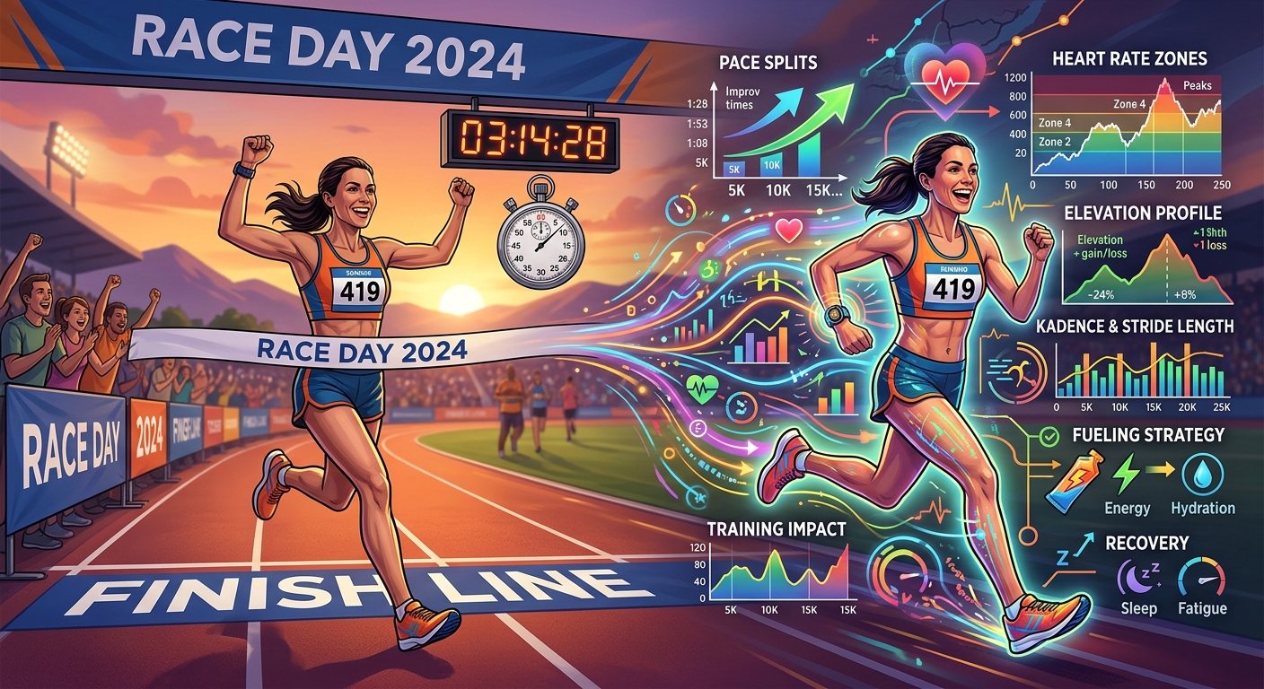
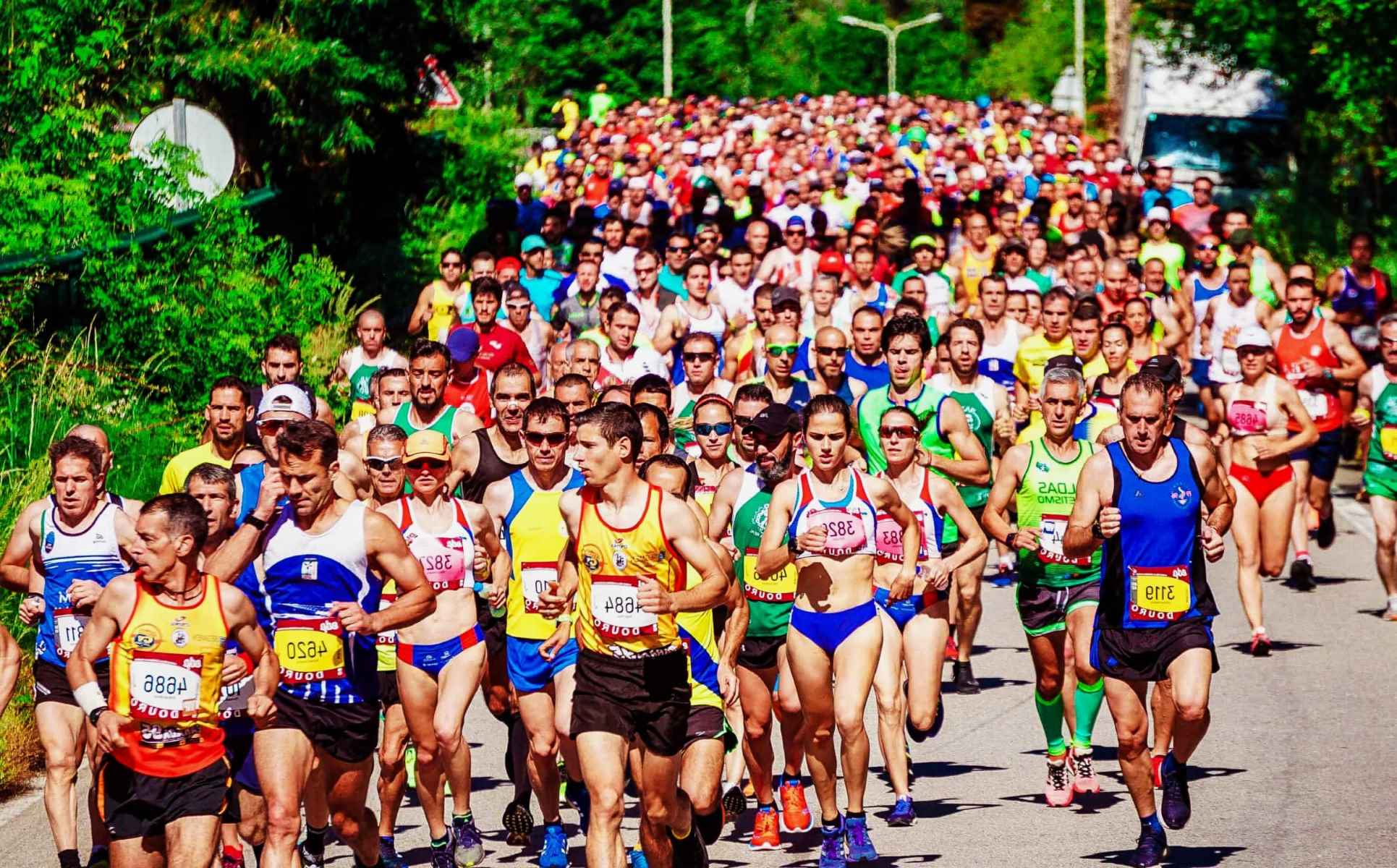
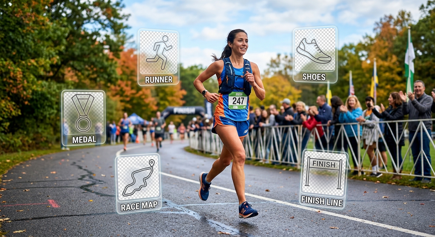
- Race recap posts work well with course-themed graphics, elevation visuals, or medal and trophy icons on transparent backgrounds that you can overlay onto your race-day photos
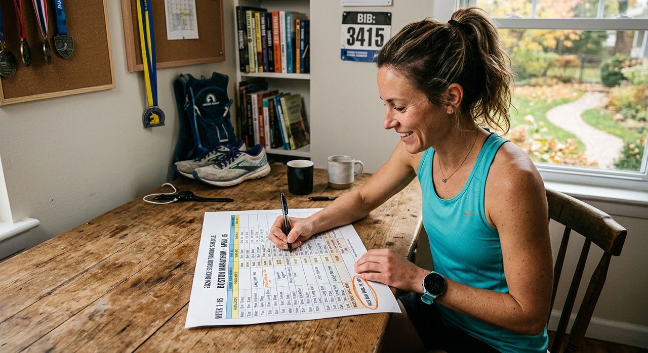
- Training plan posts benefit from calendar or timeline graphics, heart rate icons, and distance markers that make abstract numbers feel more tangible
- Gear review posts need clean product silhouettes on transparent backgrounds so the focus stays on the item, not a cluttered background
- Nutrition and fueling posts can use food icons, energy graphics, and trail snack visuals that connect the diet topic to the running context
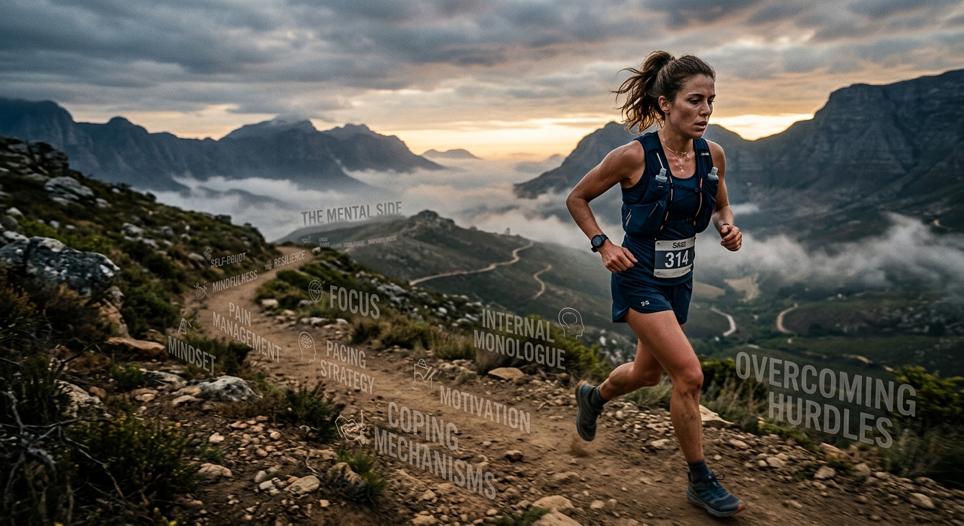
- Motivation and mindset posts are where bold silhouettes and weather or landscape graphics carry the emotional weight that stock photos usually fumble
Each of these post types benefits from a slightly different visual register. The topic index lets you filter for the right register quickly. The daily discovery feed helps you find the specific image within that register that is not what everyone else is already using.
Common Mistakes Running Bloggers Make With Visual Assets
Most visual mistakes on running blogs come from the same few patterns. Recognizing them helps you avoid them.
- Using the same image format for every post type, which makes a gear review look like a race recap and a training post look like a race guide
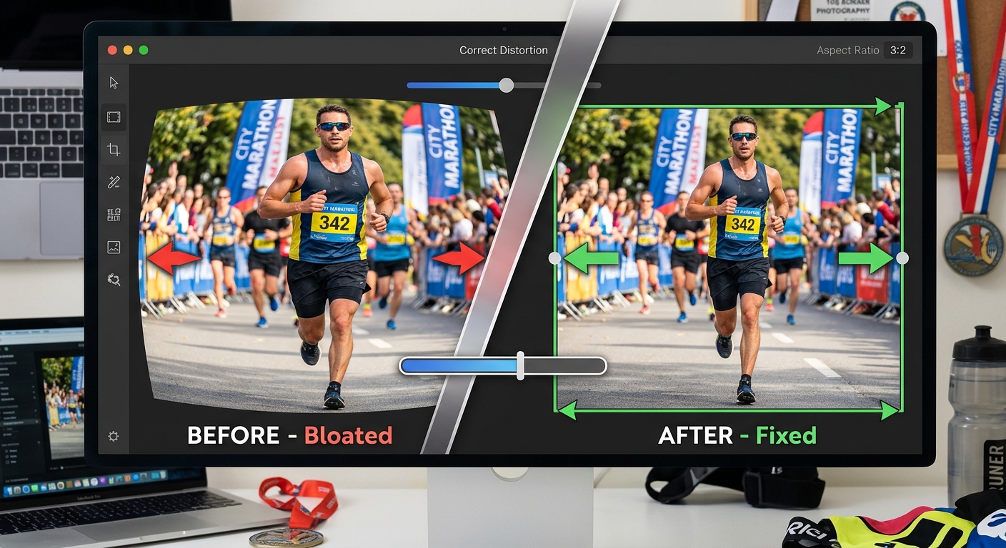
- Skipping transparent-background formats and then spending extra time in editing software trying to cut out backgrounds manually
- Pulling images from different visual styles that clash with each other across the same post, creating a design that feels assembled rather than intentional
- Never building a backlog, which leads to rushed choices under deadline pressure
- Defaulting to human-in-motion photos for every post when abstract graphics and icons often communicate the topic more clearly
The research on visual content in digital publishing backs this up. Studies from content marketing institutions consistently show that visual processing in human cognition happens faster than text processing, meaning readers form a first impression from the image before they read a single word. That impression either earns the click or loses it.
Building Consistency Across a Full Month of Content
Weekly publishing adds up. Four posts a month, each needing a thumbnail, a header image, and at least one in-post graphic, means you are sourcing twelve or more image assets every month. That is not a lot if you have a system. It is exhausting if you do not.
The combination of a topic index for planned content and a daily discovery tool for editorial serendipity gives you both reliability and freshness. You are not recycling the same five graphics because you ran out of ideas. You are not burning two hours per post on image hunting either.
Consistency also matters for your audience. Readers who follow a running blog return because they trust the voice and the look. Visual consistency, meaning a recognizable thumbnail style, a coherent color palette, and a sense that the images belong in this specific blog, builds that trust over time.
What Your Image Workflow Should Look Like Week to Week
Running coaches and bloggers who publish on tight schedules need a workflow that runs in the background, not one that requires full attention every time. Here is a realistic weekly rhythm that keeps visuals from becoming a blocker:
- At the start of each week, spend five minutes on the discovery feed and bookmark anything that sparks an idea
- When drafting a post, go to the topic index first and pull a shortlist of three to five relevant options
- Choose the image that best fits the post angle, not just the one that is most literally about running
- Keep a simple folder of unused bookmarks for future posts so good finds do not get forgotten
- Once a month, audit your visual consistency: do your last four thumbnails look like they belong to the same blog?
That last step is one most bloggers skip. But it is the one that separates a blog that looks professionally curated from one that feels like it was built post by post with no connective thread.
Where Strong Visuals Take Your Running Content Next
The goal was never to find more images. The goal is to publish running content that your audience actually opens, reads, and shares. Visuals are a big part of why that happens or does not. A thumbnail that stands out in a crowded inbox or social feed earns the click. A post header that immediately communicates the topic earns the scroll.
Running bloggers and coaches who build a real image pipeline stop thinking about visuals as a last-minute problem and start treating them as a content asset they actively cultivate. The tools exist to make that straightforward. A structured topic index handles the planned posts. A daily discovery feed handles the unexpected creative finds. Between the two, you have what you need to keep your content looking as sharp as your training plans, every single week.